We build
your vision
IconMade is the construction arm of the Icon Group, a family-run business with over ten years of experience in Melbourne’s construction industry. They specialise in high-end, luxury residential projects across Melbourne and the surrounding areas.
Client
IconMade
Services
Brand Identity
Creative Copywriting
Creative Content
Goal
With an established bathware company already under their name, the Icon brand needed a distinct identity for its construction side, IconMade. They required a fresh brand identity—both visually and in messaging—to clearly communicate what makes IconMade unique and differentiate it within the high-end residential construction market.

Approach
Through our discovery process, we uncovered that IconMade goes beyond simply building custom homes; they provide a transformative experience, bringing their clients’ visions to life. This insight became the foundation of our brand work.
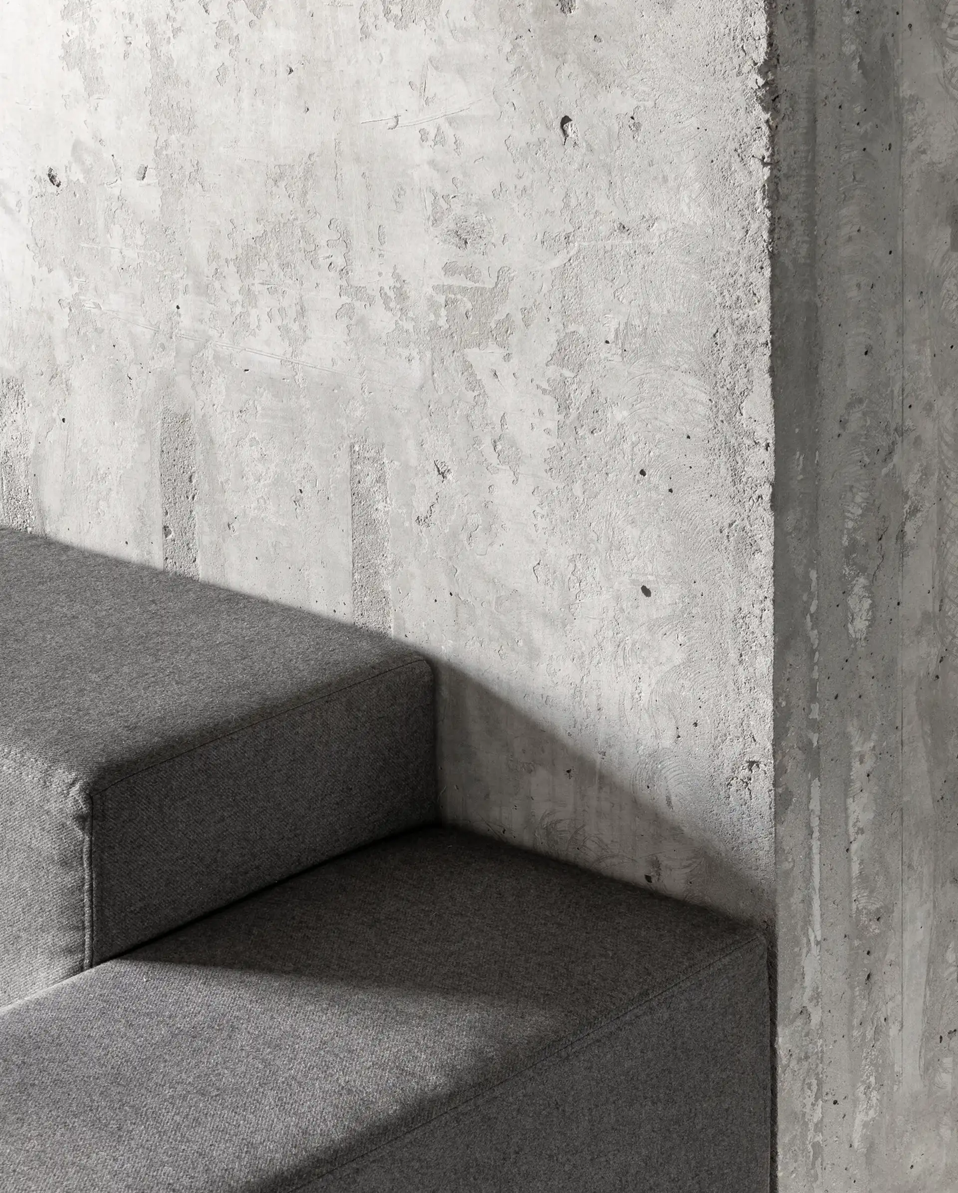
We set out to create a clean, minimalistic identity that reflects IconMade’s craftsmanship, professionalism, and approachable nature. After exploring multiple design directions, we developed a bracket-inspired logo. In English, brackets—particularly square brackets—signify a change or addition to a word or phrase. This symbol was chosen to represent the meaningful changes and enhancements IconMade brings to their clients’ homes and lives.
To complement the brand’s identity, we established a monochrome colour palette, soft shapes, and rounded corners, reinforcing a balance between precision and warmth. The result is a refined yet inviting brand presence that aligns with IconMade’s values and expertise.


